[Section 1] [Home] [Section 3]
time = new RealType("time", SI.second, null);height = new RealType("height", SI.meter, null);
The first argument in the constructor is the name (a Java String) of the RealType. This name will by used to label the axes. You can get the name of a RealType with the method RealType.getName(). The method RealType.getRealTypebyName( String name ) will return the RealType whose name is "name". Note that two RealTypes are equal if their names are equal.
The second argument is the unit of the RealType. VisAD defines all SI units (ampere, candela, kelvin, kilogram, meter, second, mole and radian) and provides methods for defining your own units. In section 2.7 we will create a new unit. By the way, you can get a RealType's unit with the method RealType.getDefaultUnit().
The third argument in the constructor is the default set of the RealType. We shall ignore the set for the time being.
The next addition we make to the first example is the call
that defines the variable dispGMC as display's GraphicsModeControl, and the subsequent callGraphicsModeControl dispGMC = (GraphicsModeControl) display.getGraphicsModeControl();
which specifies that scales should be drawn.dispGMC.setScaleEnable(true);
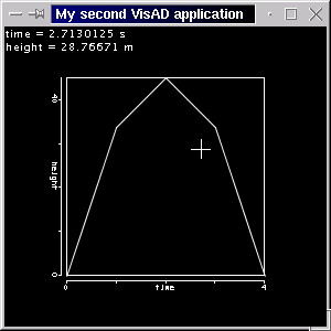
Running program P2_01 generates a window like the screen shot below.
Note that the axes are now labelled, and the cursor's position (time and height) is correctly given in seconds and meters.
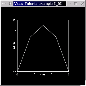
We still use the same 5 height values, but now the parabola is correctly placed in the graph, that means time doesn't range from 0 to 4, because we use an adequate Set. Note that the parabola is given by height = 45 - 5 * time^2. The Integer1DSet was used initially because we were not interested in the mathematical correctness, but only in having a set of 5 values.time_set = new Linear1DSet(time, -3.0, 3.0, 5);
After adding the heightMap to the display, we scale the y-axis (remember, heightMap has YAxis as DisplayRealType) with
The following figure is a screen shot of the example P2_02. Note that the y-axis is now scaled from 0 to 50.heightMap.setRange( 0.0, 50.0);
suggests, on the other hand, a set of (time, height) points, which are indexed by an Integer1DSet (index_set). The difference is not a trivial one. A continuous line like that of the previous example might represent the theoretical values of a continuous function and therefore is plotted as such. The latter MathType might represent a set of values from an experiment which should, therefore, be plotted disconnected.( index -> (time, height) )
The FunctionType now becomes:private RealTupleType t_h_tuple; t_h_tuple = new RealTupleType( time, height);
And the FlatField is changed to include this:func_i_tuple = new FunctionType( index, t_h_tuple);
The x-axis and the y-axis will be arbitrarily rescaled in the range from -4 to 4 and -10 to 50, respectively, using setRange().vals_ff = new FlatField( func_i_tuple, index_set); vals_ff.setSamples( point_vals );
The code for the complete example 2_03 is as follows:
// Import needed classes

import visad.*;
import visad.java2d.DisplayImplJ2D;
import java.rmi.RemoteException;
import java.awt.*;
import javax.swing.*;

/**
  VisAD Tutorial example 2_03
  Data are organized as MathType ( index  -> ( time, height )  ) and
  represent some points from the parabola of the previous example
  Data are indexed (time, height) points and get depicted as such.
  Run program with java P2_03
 */


public class P2_03{

  // Declare variables
  // The quantities to be displayed in x- and y-axes: time and height, respectively
  // Our index is alos a RealType

  private RealType time, height, index;


  // A Tuple, to pack time and height together

  private RealTupleType t_h_tuple;


  // The function ( time(i), height(i) ), where i = index,
  // represented by ( index -> ( time, height) )
  // ( time, height) are a Tuple, so we have a FunctionType
  // from index to a tuple

  private FunctionType func_i_tuple;


  // Our Data values, the points, are now indexed by the Set

  private Set index_set;


  // The Data class FlatField, which will hold time and height data.
  // time data are implicitely given by the Set time_set

  private FlatField vals_ff;


  // The DataReference from the data to display

  private DataReferenceImpl data_ref;


  // The 2D display, and its the maps

  private DisplayImpl display;
  private ScalarMap timeMap, heightMap;


  public P2_03 (String []args)
    throws RemoteException, VisADException {

    // Create the quantities
    // x and y are measured in SI meters
    // Use RealType(String name, Unit u,  Set set), set is null

    time = new RealType("time", SI.second, null);
    height = new RealType("height", SI.meter, null);


    // Organize time and height in a Tuple

    t_h_tuple = new RealTupleType( time, height);


    // Index has no unit, just a name

    index = new RealType("index");


    // Create a FunctionType ( index -> ( time, height) )
    // Use FunctionType(MathType domain, MathType range)

    func_i_tuple = new FunctionType( index, t_h_tuple);


    // Create the x_set, with 5 values, but this time using a
    // Integer1DSet(MathType type, int length)

    index_set = new Integer1DSet(index, 5);


    // These are our actual data values for time and height
    // Note that these values correspond to the parabola of the
    // previous examples. The y (height) values are the same, but the x (time)
    // are now given given.

    float[][] point_vals = new float[][]{{-3.0f, -1.5f, 0.0f, 1.5f, 3.0f,},
    					 {0.0f, 33.75f, 45.0f, 33.75f, 0.0f,} };

    // Create a FlatField, that is the Data class for the samples
    // Use FlatField(FunctionType type, Set domain_set)

    vals_ff = new FlatField( func_i_tuple, index_set);


     // and put the height values above in it

    vals_ff.setSamples( point_vals );


    // Create Display and its maps

    // A 2D display

    display = new DisplayImplJ2D("display1");


    // Get display's graphic mode control and draw scales

    GraphicsModeControl dispGMC = (GraphicsModeControl) display.getGraphicsModeControl();
    dispGMC.setScaleEnable(true);


    // Create the ScalarMaps: quantity time is to be displayed along XAxis
    // and height along YAxis
    // Use ScalarMap(ScalarType scalar, DisplayRealType display_scalar)

    timeMap = new ScalarMap( time, Display.XAxis );
    heightMap = new ScalarMap( height, Display.YAxis );


    // Add maps to display

    display.addMap( timeMap );
    display.addMap( heightMap );


    // Scale heightMap. This will scale the y-axis, because heightMap has DisplayRealType YAXIS
    // We simply choose the range from -4 to 4 for the x-axis
    // and -10.0 to 50.0 for

    timeMap.setRange( -4.0, 4.0);
    heightMap.setRange( -10.0, 50.0);


    // Create a data reference and set the FlatField as our data

    data_ref = new DataReferenceImpl("data_ref");

    data_ref.setData( vals_ff );


    // Add reference to display

    display.addReference( data_ref );


    // Create application window, put display into it

    JFrame jframe = new JFrame("VisAD Tutorial example 2_03");
    jframe.getContentPane().add(display.getComponent());


    // Set window size and make it visible

    jframe.setSize(300, 300);
    jframe.setVisible(true);


  }


  public static void main(String[] args)
    throws RemoteException, VisADException
  {
    new P2_03(args);
  }

}
The source code is available here.
If you compile it and run with java P2_03 you should be able to see the
following window.
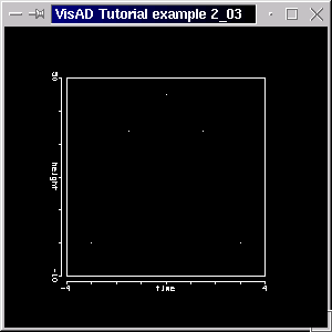
As expected, our data consisting of a set of points was plotted as such (on some high-resolution screens the points may be so small - a single pixel - that they are nearly invisible).
Note that if you call
where dispGMC is the GraphicsModeControl you can draw all lines in a display as points, without changing the MathType. The advantage is that you don't need to change the MathType, but the disadvantage is that you will only be able to draw your data as points.dispGMC.setPointMode(true);
ConstantMap[] pointsCMap = { new ConstantMap( 1.0f, Display.Red ),
                             new ConstantMap( 0.0f, Display.Green ),
                             new ConstantMap( 0.0f, Display.Blue ),
                             new ConstantMap( 3.50f, Display.PointSize )  };
display.addReference( data_ref, pointsCMap );
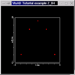
The points are now displayed as red color-filled squares, 3 pixels on a side.
Next, in addition to func_i_tuple created in the previous example, we need to create:int LENGTH = 25; time_set = new Linear1DSet(time, -3.0, 3.0, LENGTH );
Now, we need to create two arrays to hold our data values, and fill them appropriately:func_time_height = new FunctionType(time, height);
float[][] d_vals = time_set.getSamples( true);
We generate values for the line with a for-loop.float[][] h_vals = new float[1][LENGTH];
This provides the data to make a curve of 25 connected points.for(int i = 0; i < LENGTH; i++) h_vals[0][i] = 45.0f - 5.0f * (float) (d_vals[0][i]*d_vals[0][i]);
Another new feature in this example is the use of a ScalarMap
with a SelectRange as DisplayRealType to select the
time range to be displayed. In section 2.2 we scaled the y-axis. If
we had scaled it so that our data would be outside the display box,
data would still have been displayed (but outside the box!). A
ScalarMap with SelectRange as DisplayRealType will trim data depiction, so that only
the data inside the valid range will be drawn. (You might want to
combine a ScalarMap.setRange() call with a ScalarMap with SelectRange as DisplayRealType, as the former allows you to choose the range of the depicted RealType (thus scaling an axis) and the latter allows to choose the range in which the RealType can be draw (values ouside the range will be cut). You can also see section 2.11, where the difference between them should become clear.)
We create such a ScalarMap with
add it to a display like we would do with any other ScalarMap:timeRangeMap = new ScalarMap( time, Display.SelectRange );
Then we get this ScalarMap's RangeControldisplay.addMap( timeRangeMap );
To make the data displayed or visible in the range from -2 to 4, define the rangeRangeControl timeRangeControl = (RangeControl) timeRangeMap.getControl();
float[] timeRange = { -2.0f, 4.0f };The complete source code for this example is available here. If you compile it and run with java P2_05 you should be able to see the following window.timeRangeControl.setRange( timeRange );
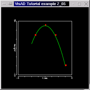
Note that data outside the range from -2 to 4 is not shown. (Compare with the previous figures, in which both line and points existed in the range -3 to 3.) Note too the smoother curve, indicating the use of more data (for the line). Of course, the plots of the point value data and the data describing the line are completely independent (try changing their values in the code).
We mapped time to XAxis and height to YAxis. We will now extend this MathType to( time -> height )
where height and speed are RealTypes and form a Tuple:( time -> (height, speed) )
Note that speed is the first derivative of height with respect to time. (You might like to know that the interface Function (subinterface of Data) actually includes a method to calculate the derivative of a Function with respect to a RealType. Remember that in VisAD a FlatField represents a mathematical function. It overrides the Data.derivative() method, with which you can calculate the derivative of a function, that is of a FlatField, with respect to a quantity, that is a RealType. But in this example we shall calculate the derivative in a for-loop. See section 4_07 for how to use Data.derivative().)h_s_tuple = new RealTupleType(height, speed);
Note that the array which will hold the height and speed values is now dimensioned like float[ number_of_range_components ][ number_of_range_samples], that is float[2][LENGTH]:func_t_tuple = new FunctionType(time, h_s_tuple);
float[][] h_s_vals = new float[2][LENGTH];
for(int i = 0; i < LENGTH; i++){

     // height values...
      h_s_vals[0][i] =  45.0f - 5.0f * (float) (t_vals[0][i]*t_vals[0][i]);

    // ...and speed values: the derivative of the above function
      h_s_vals[1][i] =  - 10.0f * (float) t_vals[0][i];
}
We create the ScalarMap
to display speed in RGB color and then we add this ScalarMap to the display. The source code for this example is available here. The figure below is a screen shot of this program.speedRGBMap = new ScalarMap( speed, Display.RGB );
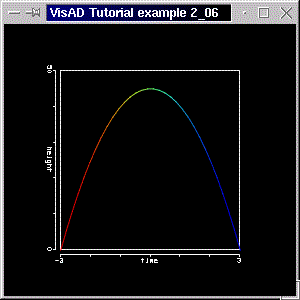
Note that speed is signed, so
positive (upward) values are colored red and negative
(downward) values are colored blue. The color look-up table ranges from blue, through green to red. The color table is automatically adjusted to the RealType it's attached to, so that the minimum value of the RealType is mapped to the minimum value of the color table (blue) and the maximum value of the RealType corresponds to that of the color table (red). Intermediate values are linearly interpolated.
In section 3 we will learn how to color a RealType using other DisplayRealTypes (like Red, Green and Blue, rather than RGB, which is attached to a pseudo color look-up table). In section 4 we will define and use a new color table.
define it withUnit mps;
and refine speed with the new unit:mps = SI.meter.divide( SI.second );
speed = new RealType("speed", mps, null);andspeedYMap = new ScalarMap( speed, Display.YAxis );
Just another little change is the callheightRGBMap = new ScalarMap( height, Display.RGB );
which results in thicker lines for the display. The source code for this example is available here and below is a screen shot of the program.dispGMC.setLineWidth( 3.0f );
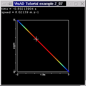
Note that speed is displayed in the y-axis, and the values for time and speed at the cursor's location are correctly given in the proper units. Remember, not speed but height is mapped to color, so now we see red near time = zero, where the height is at the maximum, and blue at both ends where heights are near the minimum.
You might want to know, that the method GraphicsModeControl.setPointWidth( float size ) changes the point size of a display (but is over-ridden by ConstantMaps to Display.PointSize, as used in section 2.4). Although the GraphicsModeControl provides you extensive controls over data depiction, VisAD provides a user interface for the it. In order to make full use of this interface, we shall only introduce it in section 3.8.
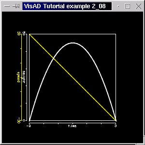
as( time -> (height, speed) )
and( time -> height )
We will need a FunctionType for each of the above functions( time -> speed )
andfunc_t_h = new FunctionType( time, height );
as well as FlatFields and DataReferences. The RealTypes height and speed are both mapped to y-axis, and speed's DataReference include a yellow ConstantMap, to distinguish speed from height. The speed's axis is equally colored yellow, but with the call ScalarMap.setScaleColor( float[] speedColor ). The complete code is available here. The program generates a window like the figure below:func_t_s = new FunctionType( time, speed );
You might also want to know that is possible to prevent an extra axis to be drawn, even though you might have added a corresponding ScalarMap (with XAxis, YAxis or ZAxis) to the display. This is achieved by calling
The code for this example already includes such a call. Just uncomment the line with speedYMap.setScaleEnable(false) to prevent the speed axis from being drawn.ScalarMap.setScaleEnable( false );
We have a Gaussian distribution curve, but we are more concerned with the region around the maximum. We have our points concentrated around this region, and only a few samples at the base of the curve. Our Gridded1DSet is defined as follows
where x is the quantity to be displayed on the x-axis, x_vals is an array float[1][LENGTH] with the x values and LENGTH is simply the number of values. The corresponding values for y are given further down in the program. We also have a ScalarMap with RealType y mapped to Display.RGB added to our display. This will color the curve according to y. The source code for this example is available here. The figure below is a screen shot of this program.x_set = new Gridded1DSet(x, x_vals, LENGTH);
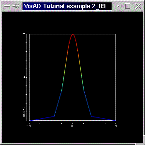
Please note the varying sampling distances, indicating the use of the Gridded1DSet.
To create a RangeWidget we simply declare one:
private RangeWidget ranWid;
Note that we have added the import statement
In the directory visad/util you will find other useful user interfaces.import visad.util.*;
We actually create such a widget with
Remeber, timeMap is the ScalarMap which of the RealType time and it's mapped to the x-axis. The final step it to add the widget to the window. You can see the code here. Running the program with "java tutorial.s2.P2_10" (and typing in the same range values given below) you should get a window like the screen shot below.ranWid = new RangeWidget( timeMap );
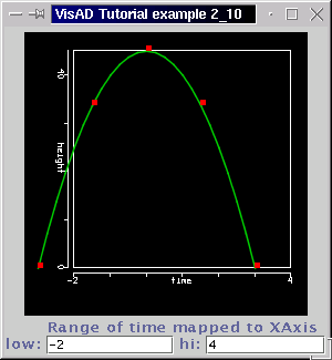
Note the range of the RealType time is between -2 and 4 (the curve only goes to 3 because our data, that is the domain set, is only defined between -3 and 3). By typing in a value in the text field and then pressing the "enter" key the display gets redrawn with the new range. You should run the example and try the widget out!
You should try to create a RangeWidget for the y-axis. You'd only need to create a widget for the heightMap and then add it to window.
added it to the display, then we got its RangeControltimeRangeMap = new ScalarMap( time, Display.SelectRange );
defined a rangeRangeControl timeRangeControl = (RangeControl) timeRangeMap.getControl();
float[] timeRange = { -2.0f, 4.0f };This is fine in case that the selected range doesn't (or shouldn't) change during runtime. To interactively change Display.SelectRange bounds, VisAD provides the SelectRangeWidget. We shall use example program P2_10 to show this widget. In the program, we declare a SelectRangeWidgettimeRangeControl.setRange( timeRange );
We also need a map likeSelectRangeWidget selRanWid;
which determines that the RealType time will have a range which can be selected, as done in section 2.5. To create the widget we calltimeRangeMap = new ScalarMap( time, Display.SelectRange );
We then add this widget to the window as we have done with the previous widget. You can see the complete code here. Running the program with "java tutorial.s2.P2_11" you should get a window with a display and with the two widgets. See the screenshot below.selRanWid = new SelectRangeWidget( timeRangeMap );
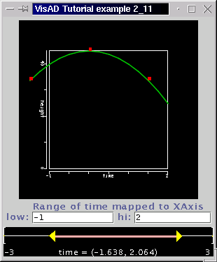
Click and drag one of the yellow triangles to change one of the boundaries. Click and drag in the middle of the range to move both ends.
If you are confused with the two widgets, then we urge you to run the example and try them out. The RangeWidget is responsible for "scaling the axis", whereas the SelectRangeWidget is responsible for selecting the range in which data can be drawn. We said in section 2.5 that you might want to combine both together in an application. Indeed, if by scaling the axis data gets drawn outside the display, you might use the SelectRangeWidget to avoid that.
In the next section we make use of 2D Sets, and introduce images.